Classbaze

Disclosure: when you buy through links on our site, we may earn an affiliate commission.

Excel Charts – Visualization Secrets for Impressive Charts

Gain Highly Advanced Excel Skills to Create Impressive Excel Graphs for your Management Reports (Excel 2010)
4.4
4.4/5
(4,862 reviews)
26,348 students
Created by

9.7

Classbaze Grade®

10.0

Freshness

8.9

Popularity

9.6

Material

Gain Highly Advanced Excel Skills to Create Impressive Excel Graphs for your Management Reports (Excel 2010)
Platform: Udemy
Video: 8h 30m
Language: English
Next start: On Demand

Best Excel Charts classes:

Classbaze Rating

Classbaze Grade®

9.7 / 10

CourseMarks Score® helps students to find the best classes. We aggregate 18 factors, including freshness, student feedback and content diversity.

Freshness

10.0 / 10
This course was last updated on 5/2022.

Course content can become outdated quite quickly. After analysing 71,530 courses, we found that the highest rated courses are updated every year. If a course has not been updated for more than 2 years, you should carefully evaluate the course before enrolling.

Popularity

8.9 / 10
We analyzed factors such as the rating (4.4/5) and the ratio between the number of reviews and the number of students, which is a great signal of student commitment.

New courses are hard to evaluate because there are no or just a few student ratings, but Student Feedback Score helps you find great courses even with fewer reviews.

Material

9.6 / 10
Video Score: 8.9 / 10
The course includes 8h 30m video content. Courses with more videos usually have a higher average rating. We have found that the sweet spot is 16 hours of video, which is long enough to teach a topic comprehensively, but not overwhelming. Courses over 16 hours of video gets the maximum score.
The average video length is 3 hours 20 minutes of 37 Excel Charts courses on Udemy.
Detail Score: 10.0 / 10

The top online course contains a detailed description of the course, what you will learn and also a detailed description about the instructor.

Extra Content Score: 9.9 / 10

Tests, exercises, articles and other resources help students to better understand and deepen their understanding of the topic.

This course contains:

13 articles.
3 resources.
0 exercise.
0 test.

In this page

About the course

Without Doubt, With This Advanced Microsoft Excel Chart Course, You will be the Excel data Visualization star in your Department! 
Significantly Improve your Reports by using Advanced Excel Graph Techniques. 
This Course Includes:
•Downloadable Workbook to follow the demonstrations (and use the charts as your templates).
•Downloadable Exercise Book (answers included).
•Full set of Cheat Sheets for download in Lecture 3. This PDF document is a quick reference guide for whenever you need to create any of the charts in this training.
If you use Excel to generate reports and graphs, myhands-on Excel training provides you with an extremely advanced toolkit worthof knowledge that will take the design of your Excel charts, tables and reports to the nextlevel. It will provide you with the best tricks to create dynamic charts.It will save you tons of time of manually updating your Excel graphs on a monthlybasis. The visualization techniques introduce you to some unusual methods tohandle and create charts which will enhance readability of your reports as wellas impress your readers. 
Lauren says: “I wish she had more courses on advanced excel and access that are formatted like this one. She frames the content in ways that are applicable to my current job. I will be able to improve my current processes and project turnaround time as well as the look/feel of my tables and charts.”
John says: “Leila does a fantastic job of walking you thru the process of creating various charts from scratch. From which formula to use to step by step chart creation. As a bonus you have actual exercises to practice your new skills, Absolutely one of the best instructional courses I have taken”
Paul says: “Course is clear, to the point and very dynamic. Excellent!”
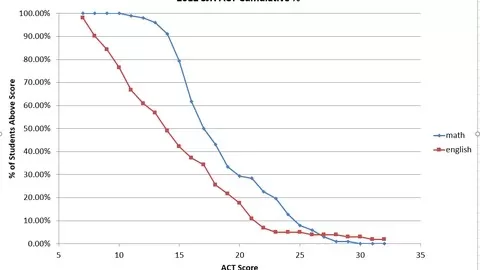
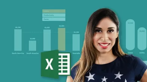
Types of Excel Charts & Excel Graphs are presented:
The content and type of Excel charts presented are those that are typical to corporate reporting. Given my background in controlling, finance and project management, I designed the training with this audience in mind and the typical methods used to report, communicate, analyze, check and plan quantitative information.
If you are a student taking this course, rest assured that you are well equipped with advanced Excel visualization & chart design techniques to impress any employer who requires you to create graphs & reports in Excel.
Demonstration will be done using Excel 2010, but all methods will be compatible with older as well as future versions of Excel unless otherwise stated in the video. My main focus is to introduce you to new “methods” of doing things which you can do no matter which Excel version you have.
Why this course is different to other Excel courses:
I will not only demonstrate to you, but youwill be able to follow each demonstration in your own Excel workbook. To make sure you have understood thetechniques, you will complete an exercise at the end of each section (answers are included but you have to try on your own first).

I place great value on keeping the training not only informative but also interesting. I know technical courses can be boring, especially when taken online. For this reason, I have mixed screen-casts together with talking head and flip chart type of demonstrations to get it as close to a classroom training style as possible.
I have also been told by many students that I have the ability to explain complex topics in an easy to understand manner. I think you will benefit from that.
This course is split to 5 major parts:
•Methods to effectively communicate and present data trends – In this section I will also provide you with a crash course in best practices for table and graph design.
•Behind the scenes secrets of dynamic charts in Excel, where I introduce you to key functions you need to use to never manually update your Excel charts again –The functions you learn here go beyond graphs and charts. They enable you to do complex look ups in large data tables.
•Techniques that highlight Excel chart and table elements to direct the reader attention where it is needed most.
•New ways to compare performance: as in Actual data versus Budget, forecasts and previous year
•Effective Chart Combinations that are pivotal to management reports
This is an Excel Advanced Chart Course BUT you will be surprised how simple the techniques are once you know them!

What can you learn from this course?

✓ Significantly improve your Excel reports to create more powerful graphs that communicate your information in the best manner
✓ Learn creative & simple techniques that allow you to create your own Excel charts from scratch
✓ Create dynamic Excel charts. Why? I have seen many cases where people are unnecessarily manually updating graphs. This costs considerable time and nerves.
✓ Impress your management by including new Excel graphs in your reports (such as my Pin chart for variances)
✓ Apply Best Practice methods to considerably improve the design of your Excel charts and tables
✓ Apply techniques that highlight chart and table elements to direct the reader attention where it is needed most
✓ Use effective Chart Combinations that are pivotal to management reports
✓ Apply best methods to compare performance in your Excel graphs: as in Actual data versus Budget, forecasts and previous year
✓ Learn by doing. Download the Demo Excel Workbook and follow each section with me. Learning by doing works best!
✓ Learn advanced Excel lookup methods (such as matrix lookups) which you can use in your larger data files.
✓ Become the Excel data Visualization star in your department by creating impressive Excel charts and graphs in your reports

What you need to start the course?

• Existing experience and knowledge of Excel’s basic charting options and formulas
• This course is aimed for current intermediate to advanced Excel users and will significantly build on existing knowledge
• Demonstration is done using Excel 2010. However, the focus of this training is to teach you new methods of doing things which you can do regardless of the Excel version you have

Who is this course is made for?

• Controller or financial analyst responsible for creating monthly, quarterly or yearly reports
• Finance or department manager looking for new effective visualization methods
• A student planning to work as a business or financial analyst or in any function that will require data visualization
• All in all, if you’re responsible for presenting your data graphically and you need to do this with Excel, you will benefit from the methods I teach in this course

Are there coupons or discounts for Excel Charts - Visualization Secrets for Impressive Charts ? What is the current price?

The course costs $15.99. And currently there is a 82% discount on the original price of the course, which was $89.99. So you save $74 if you enroll the course now.
The average price is $14.8 of 37 Excel Charts courses. So this course is 8% more expensive than the average Excel Charts course on Udemy.

Will I be refunded if I'm not satisfied with the Excel Charts - Visualization Secrets for Impressive Charts course?

YES, Excel Charts – Visualization Secrets for Impressive Charts has a 30-day money back guarantee. The 30-day refund policy is designed to allow students to study without risk.

Are there any financial aid for this course?

Currently we could not find a scholarship for the Excel Charts - Visualization Secrets for Impressive Charts course, but there is a $74 discount from the original price ($89.99). So the current price is just $15.99.

Who will teach this course? Can I trust Leila Gharani?

Leila Gharani has created 11 courses that got 87,547 reviews which are generally positive. Leila Gharani has taught 289,915 students and received a 4.7 average review out of 87,547 reviews. Depending on the information available, we think that Leila Gharani is an instructor that you can trust.
Microsoft MVP, Bestselling Instructor
Leila Gharani is a Microsoft MVP (Most Valuable Professional) dedicated to helping you create outstanding tools and reports in Excel & Google Sheets. Her courses are for those who want to shine at work, accelerate their careers and achieve more in less time.
Leila’ background is Masters in Economics, Economist, Consultant, Oracle HFM Accounting Systems Expert & Project Manager. For over 15 years she has worked in the Finance and IT departments implementing reporting systems based on Oracle and SAP. All the while using Excel VBA to automate and improve processes.
Since 5 years, Leila runs her own site and has an active YouTube channel with many engaging, high quality videos. She provides customized spreadsheet dashboard seminars and enhanced visualization techniques to large corporations. She also teaches at the University of Applied Sciences in Upper Austria.
Her courses include examples based on her experience as well as  the consulting work she has done for international companies. Many of the Excel tips and tricks she shares is based on the questions received from experienced professionals in her Excel training sessions.
She places great value on keeping her courses not only informative but also engaging. For this reason, students will find enough challenges, exercises and downloadable files to practice so they can maximize the value gained from each course.
Leila’s passion is learning, sharing and solving difficult data analysis problems.
Browse all courses by on Classbaze.

9.7

Classbaze Grade®

10.0

Freshness

8.9

Popularity

9.6

Material

Platform: Udemy
Video: 8h 30m
Language: English
Next start: On Demand

Classbaze recommendations for you