Classbaze

Disclosure: when you buy through links on our site, we may earn an affiliate commission.

Data Storytelling and Data Visualization [2022]

Learn Data Visualization for Data Analysis and Data Science - Applicable to all tools: Excel, Power BI, R, Python & more
4.4
4.4/5
(2,348 reviews)
22,742 students
Created by

9.1

Classbaze Grade®

9.0

Freshness

8.4

Popularity

9.2

Material

Learn Data Visualization for Data Analysis and Data Science - Applicable to all tools: Excel
Platform: Udemy
Video: 5h 45m
Language: English
Next start: On Demand

Best Data Visualization classes:

Classbaze Rating

Classbaze Grade®

9.1 / 10

CourseMarks Score® helps students to find the best classes. We aggregate 18 factors, including freshness, student feedback and content diversity.

Freshness

9.0 / 10
This course was last updated on 6/2021.

Course content can become outdated quite quickly. After analysing 71,530 courses, we found that the highest rated courses are updated every year. If a course has not been updated for more than 2 years, you should carefully evaluate the course before enrolling.

Popularity

8.4 / 10
We analyzed factors such as the rating (4.4/5) and the ratio between the number of reviews and the number of students, which is a great signal of student commitment.

New courses are hard to evaluate because there are no or just a few student ratings, but Student Feedback Score helps you find great courses even with fewer reviews.

Material

9.2 / 10
Video Score: 8.4 / 10
The course includes 5h 45m video content. Courses with more videos usually have a higher average rating. We have found that the sweet spot is 16 hours of video, which is long enough to teach a topic comprehensively, but not overwhelming. Courses over 16 hours of video gets the maximum score.
The average video length is 5 hours 08 minutes of 163 Data Visualization courses on Udemy.
Detail Score: 9.4 / 10

The top online course contains a detailed description of the course, what you will learn and also a detailed description about the instructor.

Extra Content Score: 9.9 / 10

Tests, exercises, articles and other resources help students to better understand and deepen their understanding of the topic.

This course contains:

2 articles.
3 resources.
0 exercise.
0 test.

In this page

About the course

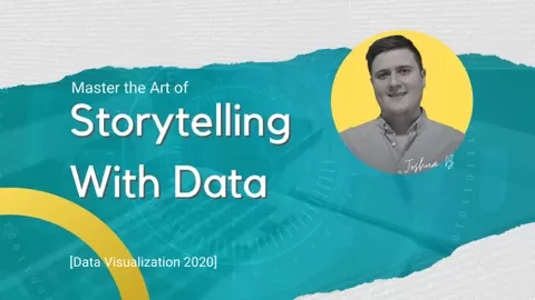
The most updated and complete Storytelling with Data and Data Visualization course on Udemy! You’ll learn the skills that make up the entire art of speaking the language of data: from communicating with data, to creating impactful data visualizations, to storytelling with data, to driving action with data-driven decisions, and finally to creating stunning communications, that will leave a lasting impression on an audience and get results.
Right now in 2020, there is a huge shortage of people who can effectively communicate with data – recruiters and businesses the world over are seeking professionals who can turn data into a meaningful story. The demand for talented professionals who can compel and audience with a well crated and engaging story from data is increasing at an insane rate. More and more companies are finally figuring out how important it is to be able to converse with data and the role it plays to their success.
Students aren’t required to know anything beforehand – I’ll teach you the fundamentals, how to apply them, how to develop into an advanced data visualization expert.
Who this course is for:
Anyone who has an audience who would benefit from insightful data communications
Anyone wanting to learn how to tell stories with data
Anyone who wants to create impactful Data Visualizations
Already established Data Scientists who want to advance their skillset
Entrepreneurs looking to master the art of communicating with data

What can you learn from this course?

✓ Storytelling with data
✓ Data visualization
✓ Create rich informative data graphs
✓ Craft compelling narratives with data
✓ Speak the language of data
✓ Create impactful data visualisztions
✓ Discover important context to understand data
✓ Format your graphs for impact
✓ Turn default graphs from tools such as Excel and Google Sheets into effective data communications

What you need to start the course?

• Basic Spreadsheet knowledge

Who is this course is made for?

• Anyone who wants to create powerful data visualizations for analytics or data science
• Anyone with an audience who values insightful information
• Anyone looking to create impact data communications that will resonate with an audience
• Anyone in business who wants to tell great stories with data

Are there coupons or discounts for Data Storytelling and Data Visualization [2022] ? What is the current price?

The course costs $19.99. And currently there is a 83% discount on the original price of the course, which was $119.99. So you save $100 if you enroll the course now.
The average price is $16.0 of 163 Data Visualization courses. So this course is 25% more expensive than the average Data Visualization course on Udemy.

Will I be refunded if I'm not satisfied with the Data Storytelling and Data Visualization [2022] course?

YES, Data Storytelling and Data Visualization [2022] has a 30-day money back guarantee. The 30-day refund policy is designed to allow students to study without risk.

Are there any financial aid for this course?

Currently we could not find a scholarship for the Data Storytelling and Data Visualization [2022] course, but there is a $100 discount from the original price ($119.99). So the current price is just $19.99.

Who will teach this course? Can I trust Joshua Brindley?

Joshua Brindley has created 5 courses that got 2,731 reviews which are generally positive. Joshua Brindley has taught 24,582 students and received a 4.5 average review out of 2,731 reviews. Depending on the information available, we think that Joshua Brindley is an instructor that you can trust.
Data Visualisation Expert
Passionate about data, and even more passionate about sharing.

I love telling great stories with data, and driving results with visualisation that resonate with an audience.

I’ve helped plenty of people learn that art of communicating in the language of data, and I’d love to help you too!

Visual Design, Storytelling Skills, Understanding the Context of Analysis, Formatting Graphs and Data Narrative templates is what i teach in a fun, engaging way to teach you how to tell impactful stories with your data.
Browse all courses by on Classbaze.

9.1

Classbaze Grade®

9.0

Freshness

8.4

Popularity

9.2

Material

Platform: Udemy
Video: 5h 45m
Language: English
Next start: On Demand

Classbaze recommendations for you