Classbaze

Disclosure: when you buy through links on our site, we may earn an affiliate commission.

The Data Visualization Course: Excel, Tableau, Python, R

Data visualization in Excel, Tableau, Python, and R. Create stunning charts and learn the most in-demand skills in 2020
4.5
4.5/5
(701 reviews)
6,868 students
Created by

9.6

Classbaze Grade®

10.0

Freshness

8.6

Popularity

9.5

Material

Data visualization in Excel
Platform: Udemy
Video: 8h 52m
Language: English
Next start: On Demand

Best Data Visualization classes:

Classbaze Rating

Classbaze Grade®

9.6 / 10

CourseMarks Score® helps students to find the best classes. We aggregate 18 factors, including freshness, student feedback and content diversity.

Freshness

10.0 / 10
This course was last updated on 5/2022.

Course content can become outdated quite quickly. After analysing 71,530 courses, we found that the highest rated courses are updated every year. If a course has not been updated for more than 2 years, you should carefully evaluate the course before enrolling.

Popularity

8.6 / 10
We analyzed factors such as the rating (4.5/5) and the ratio between the number of reviews and the number of students, which is a great signal of student commitment.

New courses are hard to evaluate because there are no or just a few student ratings, but Student Feedback Score helps you find great courses even with fewer reviews.

Material

9.5 / 10
Video Score: 8.9 / 10
The course includes 8h 52m video content. Courses with more videos usually have a higher average rating. We have found that the sweet spot is 16 hours of video, which is long enough to teach a topic comprehensively, but not overwhelming. Courses over 16 hours of video gets the maximum score.
The average video length is 5 hours 08 minutes of 163 Data Visualization courses on Udemy.
Detail Score: 10.0 / 10

The top online course contains a detailed description of the course, what you will learn and also a detailed description about the instructor.

Extra Content Score: 9.5 / 10

Tests, exercises, articles and other resources help students to better understand and deepen their understanding of the topic.

This course contains:

15 articles.
0 resource.
0 exercise.
0 test.

In this page

About the course

Do you want to learn how to create a rich variety of graphs and charts?
Do you wish you had superior data interpretation skills?
Does your workplace require data visualization proficiency?
Yes, yes, and most likely yes.
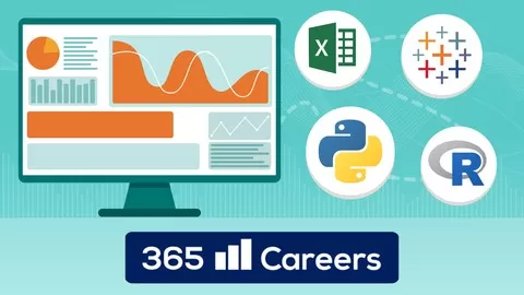
The Complete Data Visualization Course is here for you with TEMPLATES for all the common types of charts and graphs in Excel, Tableau, Python, and R!
These are 4 different data visualization courses in 1 course!
Whether your preferred environment is Excel, Tableau, Python, or R, this course will enable you to start creating beautiful data visualizations in no time!
You will not only learn how to create charts, but also how to label them, style them, and interpret them. Moreover, you will receive immediate access to all templates we work with in the lessons. Simply download the course files, replace the dataset, and amaze your audience!
Graphs and charts included in The Complete Data Visualization Course:
•Bar chart
•Pie chart
•Stacked area chart
•Line chart
•Histogram
•Scatter plot
•Scatter plot with a trendline (regression plot)
We live in the age of data. And being able to gather good data, preprocess it, and model it is crucial.
However, there is nothing more important than being able to interpret that data. And data visualization allows us to achieve just that.
Data visualization is the face of data. Many people look at the data and see nothing. The reason for that is that they are not creating good visualizations. Or even worse – they are creating nice graphs but cannot interpret them accurately.
This course will tackle both of these problems. We will make sure you can confidently create any chart that you need to provide a meaningful visualization of the data you are working with. Not only that – you will be able to label and style data visualizations to achieve a ready-for-presentation graph. Furthermore, through this course, you will learn how to interpret different types of charts and when to use them. We will provide examples of great charts as well as terrible charts. We will spare no effort in transforming you into the key person for data visualizations in any team.
We are confident that by the time you complete this course, creating and understanding data visualizations will be a piece of cake for you!
What makes this course different from the rest of the Data Visualization courses out there?
•4 different data visualization courses in 1 course – we cover Excel, Tableau, Python and R
•Ready-to-use templates for all charts included in the course
•High-quality production – Full HD and HD video and animations crafted professionally by our experienced team of visual artists
•Knowledgeable instructor team with experience in teaching on Udemy
•Complete training – we will cover all common graphs and charts you need to become an invaluable member of your data science team
•Excellent support – if you don’t understand a concept or you simply want to drop us a line, you’ll receive an answer within 1 business day
•Dynamic – we don’t want to waste your time! The instructor sets a very good pace throughout the whole course
Why do you need these skills?
•Salary/Income – careers in the field of data science are some of the most popular in the corporate world today. Literally every company nowadays needs to visualize their data, therefore the data viz position is very well paid
•Promotions – being the person who creates the data visualizations makes you the bridge between the data and the decision-makers; all stakeholders in the company will value your input, ensuring your spot on the strategy team
•Secure future – being able to understand data in today’s world is the most important skill to possess and it is only developed by seeing, visualizing and interpreting many datasets
Please bear in mind that the course comes with Udemy’s 30-day money-back guarantee. And why not give such a guarantee? We are certain this course will provide a ton of value for you.
Let’s start learning together now!

What can you learn from this course?

✓ Master data visualization
✓ Learn how to label and style a graph
✓ Interpret data
✓ Select the right type of chart
✓ Discover findings through data visualization
✓ Create stunning visualizations
✓ How to create a Bar chart
✓ How to create a Pie chart
✓ How to create a Stacked area chart
✓ How to create a Line chart
✓ How to create a Histogram
✓ How to create a Scatter plot
✓ How to create a Scatter plot with a trendline (regression plot)

What you need to start the course?

• No prior experience is required. We will start from the very basics
• You’ll need to install at least one of the 4 software (Excel, Tableau, Python, or R). We will show you how to do that step by step

Who is this course is made for?

• Ideal for beginners
• Anyone who wants to start a career in data science or business intelligence
• People who want to level-up their career with data visualization skills
• Anyone who wants to add value to their company

Are there coupons or discounts for The Data Visualization Course: Excel, Tableau, Python, R ? What is the current price?

The course costs $17.99. And currently there is a 82% discount on the original price of the course, which was $99.99. So you save $82 if you enroll the course now.
The average price is $16.0 of 163 Data Visualization courses. So this course is 12% more expensive than the average Data Visualization course on Udemy.

Will I be refunded if I'm not satisfied with the The Data Visualization Course: Excel, Tableau, Python, R course?

YES, The Data Visualization Course: Excel, Tableau, Python, R has a 30-day money back guarantee. The 30-day refund policy is designed to allow students to study without risk.

Are there any financial aid for this course?

Currently we could not find a scholarship for the The Data Visualization Course: Excel, Tableau, Python, R course, but there is a $82 discount from the original price ($99.99). So the current price is just $17.99.

Who will teach this course? Can I trust 365 Careers?

365 Careers has created 80 courses that got 554,940 reviews which are generally positive. 365 Careers has taught 1,908,152 students and received a 4.6 average review out of 554,940 reviews. Depending on the information available, we think that 365 Careers is an instructor that you can trust.
Creating opportunities for Business & Finance students
Browse all courses by on Classbaze.

9.6

Classbaze Grade®

10.0

Freshness

8.6

Popularity

9.5

Material

Platform: Udemy
Video: 8h 52m
Language: English
Next start: On Demand

Classbaze recommendations for you