Classbaze

Disclosure: when you buy through links on our site, we may earn an affiliate commission.

Professional Dashboards in Excel and Tableau

Complete Dashboards: Excel, Tableau, Pivot Tables, Slicers, Filters, Design, Templates
4.2
4.2/5
(47 reviews)
360 students
Created by

9.3

Classbaze Grade®

10.0

Freshness

8.2

Popularity

9.1

Material

Complete Dashboards: Excel
Platform: Udemy
Video: 2h 38m
Language: English
Next start: On Demand

Best Data Visualization classes:

Classbaze Rating

Classbaze Grade®

9.3 / 10

CourseMarks Score® helps students to find the best classes. We aggregate 18 factors, including freshness, student feedback and content diversity.

Freshness

10.0 / 10
This course was last updated on 5/2022.

Course content can become outdated quite quickly. After analysing 71,530 courses, we found that the highest rated courses are updated every year. If a course has not been updated for more than 2 years, you should carefully evaluate the course before enrolling.

Popularity

8.2 / 10
We analyzed factors such as the rating (4.2/5) and the ratio between the number of reviews and the number of students, which is a great signal of student commitment.

New courses are hard to evaluate because there are no or just a few student ratings, but Student Feedback Score helps you find great courses even with fewer reviews.

Material

9.1 / 10
Video Score: 7.9 / 10
The course includes 2h 38m video content. Courses with more videos usually have a higher average rating. We have found that the sweet spot is 16 hours of video, which is long enough to teach a topic comprehensively, but not overwhelming. Courses over 16 hours of video gets the maximum score.
The average video length is 5 hours 08 minutes of 163 Data Visualization courses on Udemy.
Detail Score: 10.0 / 10

The top online course contains a detailed description of the course, what you will learn and also a detailed description about the instructor.

Extra Content Score: 9.5 / 10

Tests, exercises, articles and other resources help students to better understand and deepen their understanding of the topic.

This course contains:

3 articles.
0 resource.
0 exercise.
0 test.

In this page

About the course

What you’ll learn in this course?
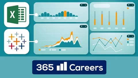
Professional Dashboards in Excel and Tableau will teach you how to create visually compelling reports with both Excel and Tableau!
Whether you prefer working with Excel or Tableau, this course will enable you to create beautiful reports from scratch!
Dynamic and meaningful visual reports have now become the focus of most business interactions. With dashboards, you can gain crucial insights from the company’s data and present information to investors or clients. That makes building a compelling dashboard a highly demanded skill which can make or break your chances of securing a place in the strategic team of your company. So, if you are looking for ways to improve your data visualization proficiency and boost your career prospects, look no further!
Professional Dashboards in Excel and Tableau will show you not only how to create reports, but also how to style them to perfection and interpret them with ease. You’ll also have access to the elegant color template we work with during the lessons, so you can apply it to your future reports for a professional and cohesive look. In addition, we’ll help you with advice on how to create your own dashing templates using the best free online platforms out there.
Here’s what you will find in this unique course:
· Introduction into the main principles of data visualization
We discuss topics such as color theory, how to choose the right visualization based on your data, and showcase a few online platforms that can aid you on your data visualization journey.
· The entire process of making a dashboard in Excel
Starting from the very beginning, we’ll show you techniques that you can successfully apply to every Excel report. We work on real-world data and create a report based on data from a real firm, operating in the fast-moving consumer goods sector.
· Creating a dashboard in Tableau
Again, our data comes from the real-world FMCG industry. In the process of crafting the components, we’ll get familiar with a wide range of techniques for building charts and other elements available in Tableau.
But it doesn’t end there!
You’ll also learn how to add custom time filters on both Excel and Tableau. Creating a time filter in Excel is a technical task, but with a well thought through idea and a neatly planned execution, everything is possible. This type of filter can then be applied to any report featuring time series data. So, you can transfer this knowledge to all future reports you’re in charge of.
In Tableau, we’ll see various software options for customizing and styling filters. There are numerous possibilities to design and style filters in Tableau, and integrating it into a dashboard is easy and intuitive. Even if you’ve never worked with the software before, you’ll quickly become the master of creating dazzling charts and reports.
Who is this course for:
People who want to level up their career with data visualization skills
Anyone who wants to improve their Excel and Tableau skills
Anyone interested in dynamic visualization techniques
People who are looking for a career in business intelligence or analytics

What can you learn from this course?

✓ Techniques for choosing an appropriate visualization based on your data
✓ Approaches for selecting the best colors scheme for a professional presentation
✓ How to build stunning interactive dashboard reports
✓ Methods to use real-world data sets to solve a business problem from the FMCG sector
✓ How to master Excel Pivot Tables and the Developer tab
✓ Ways to create custom based time Filters in Tableau
✓ Skills to style and format a presentation-worthy dashboard
✓ How to successfully interpret the results from a report in Excel and Tableau

What you need to start the course?

• You have Excel installed on your computer (we’ll guide you through installing Tableau)
• You have some experience with writing basic formulas in Excel and are comfortable with the spreadsheet environment
• You are motivated and eager to enhance your data visualization skills

Who is this course is made for?

• People interested in enhancing their data viz skillset
• Anyone who wants to gain a valuable skill
• The course is also ideal for beginners, as it starts from the fundamentals and gradually builds up your skills

Are there coupons or discounts for Professional Dashboards in Excel and Tableau ? What is the current price?

The course costs $19.99. And currently there is a 82% discount on the original price of the course, which was $109.99. So you save $90 if you enroll the course now.
The average price is $16.0 of 163 Data Visualization courses. So this course is 25% more expensive than the average Data Visualization course on Udemy.

Will I be refunded if I'm not satisfied with the Professional Dashboards in Excel and Tableau course?

YES, Professional Dashboards in Excel and Tableau has a 30-day money back guarantee. The 30-day refund policy is designed to allow students to study without risk.

Are there any financial aid for this course?

Currently we could not find a scholarship for the Professional Dashboards in Excel and Tableau course, but there is a $90 discount from the original price ($109.99). So the current price is just $19.99.

Who will teach this course? Can I trust 365 Careers?

365 Careers has created 80 courses that got 554,516 reviews which are generally positive. 365 Careers has taught 1,906,572 students and received a 4.6 average review out of 554,516 reviews. Depending on the information available, we think that 365 Careers is an instructor that you can trust.
Creating opportunities for Business & Finance students
Browse all courses by on Classbaze.

9.3

Classbaze Grade®

10.0

Freshness

8.2

Popularity

9.1

Material

Platform: Udemy
Video: 2h 38m
Language: English
Next start: On Demand

Classbaze recommendations for you